Are there ideal sizes for your newsletter templates? How should you choose the widths and heights of your emails so that they will look great on any device and be convenient for your subscribers to read?
This topic is very complex and can't be covered in just a few paragraphs.
Now, let's talk about the acceptable widths for emails, the best widths for all email elements, and ways to adjust these elements for various email clients, screens, and devices.
What's the best email width?
For quite a while, the standard email template width was 600 pixels for desktop, 320 px for vertical orientation, and 480 px for horizontal orientation on mobile devices. The height was unlimited and depended solely on content length. But today, the situation is different.
An article on the Litmus blog claims that the recommended 600 px email width is a myth. We totally agree on that, as there are now more options than the conventional 600 px width. Yet it remains the standard size for email newsletters. How did this width appear? Why is it exactly 600 px?
A long time ago, screen resolution was far from perfect. And the number of devices was much lower than it is now. This was when the 600 px width appeared. Since then, a lot of things have changed. So today, the 600 px width is more of a tradition than a rule.
Have a look at this awesome HTML email example with a standard width of 600px:
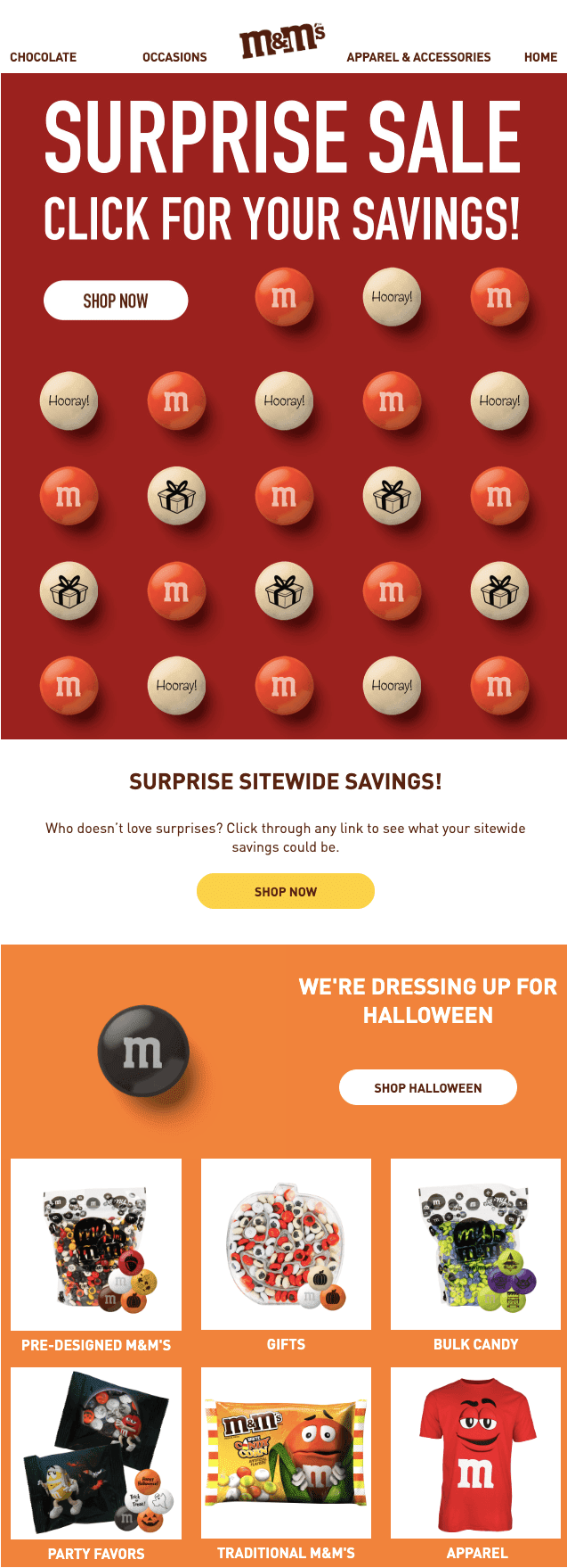
(Source: Email from M&M's. The width is 600 pixels. Gmail, macOS)
Some email clients do not fully display emails that are wider than 650 pixels. According to a study by Email on Acid, even though screen resolutions have gotten larger, email clients like Yahoo Mail and Outlook still have problems displaying wide emails. This is because most users of these clients use a three-column view, and less than 50% of the screen is left for viewing email.
Tests conducted by Email on Acid showed that the maximum width of an email that can fit on the screen in Outlook and Yahoo is approximately 650 pixels. So, if a significant number of your subscribers use these email clients, we recommend that you stay below 650px or simply use the most common width of 600px.
I built an email with a width of 860 px. It worked well across all major email clients, though its background was not displayed in Microsoft Outlook.
The email below, which I received from a famous brand, is further proof that 600 px is just the average width of an email, not a mandatory width.
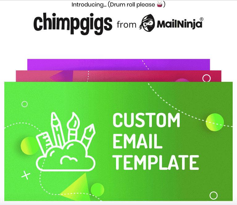
(Source: Email from MailNinja. The width is 740 pixels. Gmail, macOS)
There's also a belief that Gmail won't show any background images or color if your email template width exceeds 640 px. However, numerous tests with our email testing tool and multiple emails that I've opened in my Gmail account prove the opposite — emails and even backgrounds render perfectly well.
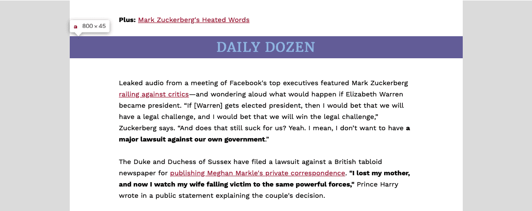
(Source: Email from Forbes Daily Dozen. Email width 800px. Gmail, macOS)
Another myth is that the maximum width of emails for Yahoo! Mail should not exceed 650 px. In contrast, my email with a width of 860 px was full size in this email client.
If you decide to choose a width that differs from 600 px, just test your email before sending it with our embedded email testing tool, which will provide exact images of how your email will be displayed in different email clients and on multiple devices.
We've noticed that famous American brands' average width of emails varies between 640 px and 700 px.

(Source: Email from Banana Republic. The width is 640 px. Gmail, macOS)
So, how to set an email template width with Stripo?
By default, it is already 600 px!
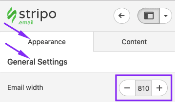
But if you'd like to set your own, you need to:
- click the Appearance tab in the editor,
- click the General Settings tab, and
- set the necessary width.
What's the best email height?
Of course, the email template height is unlimited. You may use as many rows as you want. However, we should always remember that the longer the email, the lower the chance that it will be read to the end.
The total height of a web page is 960 px, which is usually not enough to introduce all the info you've prepared to share in an email. You can't get away from scrolling. The most common email length varies from 1500 px to 2000 px. That's usually enough to put all the necessary content in one email and easy for users to scroll through.
Fun fact: Emails that belong to the tourism industry are the longest of all industries. Ecommerce emails are also long, even though product cards are usually very compact and don't need much space. This is because email marketers always promote too many products in one email.
Here is an example of an email with a height of 2550 px:

(Source: Email from Violet Grey, height 2 500 px)
Important to note:
When content blocks rearrange on mobile devices, the length of your email increases.
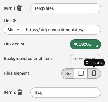
If you believe that your email will be too long on smartphones, you can always hide some email elements with Stripo.
How to hide email elements on mobile devices:
- click the element in an email template to activate its settings;
- in the settings panel, scroll down to find the "Hide element" option;
- click the "On mobile" icon;

-
done. The chosen email element/elements will not be displayed on mobile devices that support media queries.
Email preview dimensions
Some email clients, like Thunderbird, have preview windows with the following dimensions: 600 px wide and 300-500 px high. Such a window doesn't show a decreased copy of a whole email but instead captures the upper part of an email.
Ensure that the first 300-500 px (half of the first screen of your email) have valuable information that will convince users to open and read the email. A good first impression is better than a thousand likes.
Just to let you know, the people who use these email clients will not make up half of your contact list, so there's no need to change your email widths.
Here is how the preview pane looks in email client mail.com:
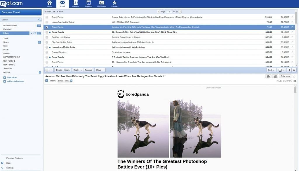
(Source: Email from Bored Panda, mail.com)
Email preheader size
A preheader is a line/email element that goes above a template and can also be seen in the "Email preview area" of users' inboxes. We'll talk about the former here. It comprises a short intro message that appears alongside an option to view the email in a browser or open a web version if there are any problems with email rendering. Some brands place very important information, like notifications about free shipping, in the preheader.
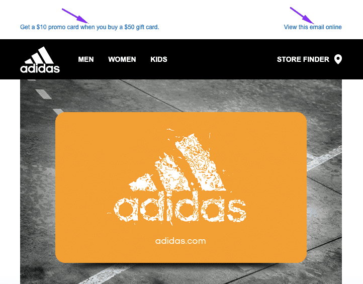
(Source: Email from Adidas)
Because this field is technical rather than contextual, you shouldn't make it large or place any additional elements in it.
The size of the preheader field varies from 50 px to 65 px high. The preheader width inherits the width of the entire email.
When building this email element, you must add a link to the "Web version" of your email.
How do you get a link to a web version of your email with Stripo:
-
once your email is built, go to the Preview mode;
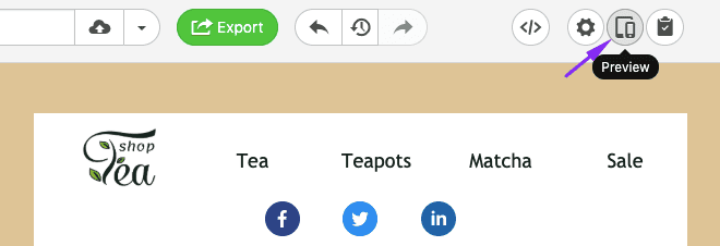
-
in a new window, click the "Copy" button;

-
done — the link has been saved to your clipboard.
Important to note:
We are now talking about the preheader as an email element. Yet there is also the preheader text, which you can set with Stripo btw. The preheader text is shown in the email preview area in inboxes only.

The preheader element is displayed in the email as well.
Email header size
The most common height for a header that doesn't contain a menu or massive logo is 70 px. For those who have a menu bar, the email header size may be 150-200 px high. The height of the header that increases by 300 px is not convenient to read.
Hundreds and thousands of styles are used for email header design, but you should choose one that is simultaneously user and mobile friendly. In addition, you should choose the style and color scheme that best fit your brand identity.
Here are a few examples of good email header design:

(Source: Email from Bentalls)

(Source: Email from GeekBrains)

(Source: Email from SEMrush)
Important to note:
Normally, an email menu contains 3-5 tabs. If you add more, please be sure to hide the extra tabs for mobile devices.
For more information on how to build an email header with Stripo, please refer to our blog post.
Email banner size
A banner is where you may use all your creativity without being tied up with sizes. The less content you put in there, the better the results. The clearer the call to action (CTA) you place there, the higher the conversion.
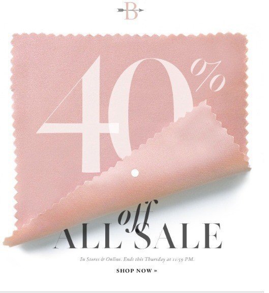
(Source: Email from BHLDN)
Here, you may experiment with font sizes. The most popular banners have images as their backgrounds and are located just after the header.
The best size for an email banner
Dimensions of 600 px by 300 px and 600 px by 400 px are the most popular email banner sizes. A lot of email designers experiment here. Although the width is limited by the email ad size, the length may vary.
Important to note:
With Stripo, you can choose your banner shape, which is called "Orientation." It can be vertical (in that the height is longer than the width), square, or horizontal (in that the width is bigger than the height).
If you choose “any,” you will not have to set any dimensions, as the width will inherit its size from the email template size and the height will depend on the chosen orientation.
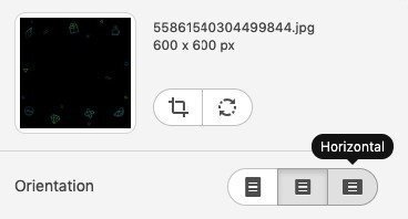
Horizontal is the most popular type of orientation for banners.
For more information on how to build banners with Stripo, please refer to our "How to Create Banner with Stripo Email Builder within Minutes" blog post.
Email button size
There is no standard email width for buttons. The most common requirement is that a button should contrast with all other email elements but, at the same time, organically match the email design.
To make your button noticeable and clickable, you should work on its design and size.
If the CTA copy is short, be sure to use some whitespace to make your button look wider. In Stripo, this is called "Internal padding."
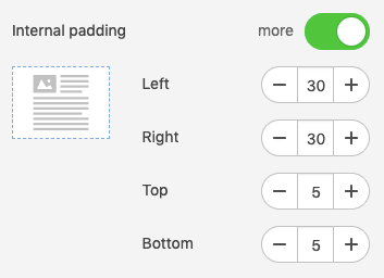
Don't worry. Due to our unique button layout, this whitespace is clickable :)
Readers do not need to click on the button text; they can click wherever they want.
It is also very important to take care of your mobile audience and make any buttons as big as possible to enable readers to click these buttons with their thumbs without clicking any other elements while reading your emails on mobile devices.
Sometimes, it's hard to find a button or read its CTA because it is small in size and its font is hardly legible.
So, how can you make your buttons' font size large and make them full width on mobile devices?
To set a larger CTA button font on mobile devices, you will need to:
- go to the "Appearance" tab,
- enter the "Mobile view" section,
- set the necessary button text size, and
- toggle the "Full-width" button.
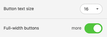
16 pixels is the most common size for button texts.
Here is an example when contrast comes to play:

(Source: Email from Jobvite)
Here is one more widely used example of a button — a button over a banner:

(Source: Email from Forbes)
How to locate a button over banners, read in our "Build banners" blog post.
Email image size
If we are talking about banners, it is important to mention that a banner will inherit its width from the newsletter width. If we are talking about product cards, there are absolutely no standards set for email image size.
However, there is one best practice for email image size: make sure the height is proportional to the width. Once you've uploaded your image, you may change its width, and its height will change proportionally (i.e., the width-to-height ratio will be maintained).

In Stripo, you can crop and edit images with our embedded photo editor "Pixie" to set the necessary image sizes for emails. To enter the editing mode, you must click the "Edit image" button next to an image in the settings panel.
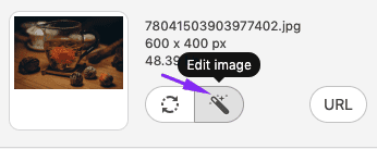
Important to note:
Please remember to compress image sizes. Otherwise, your email will be too heavy, which might have a negative impact on loading speeds for mobile devices. You may do this with Tiny.png or any other special tool of its kind.
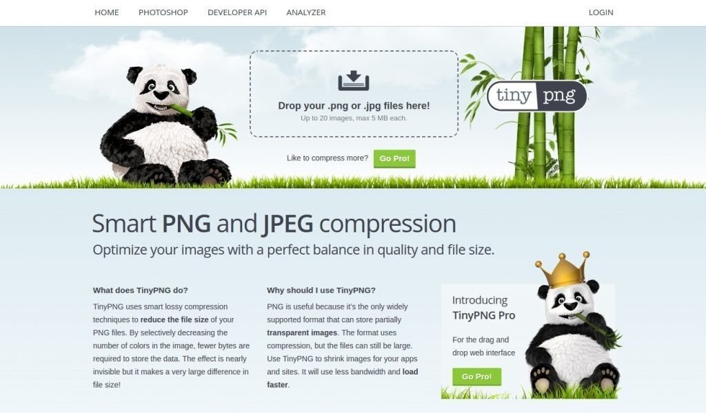
(Source: the TinyPNG website, homepage)
Content block size in email template
A content block (aka a product card) normally consists of text, an image/photo snippet, and a button.
We have previously discussed the sizes of images and buttons. As for the text, there are no limits, as it always inherits the width of email rows or containers/blocks. You can place copy over, under, or above any images. It is totally at your discretion.

(Source: Email from the White Room)
Number of content blocks in email template
We dare to say, "Less is more." You can use pictures, but don't overload your email with photos that don't offer any helpful info or have no relation to the email's subject.
Don't try to stuff one email with all the products on your website, like new arrivals or sale proposals. It's better to add only the best offers and provide a link to the website.
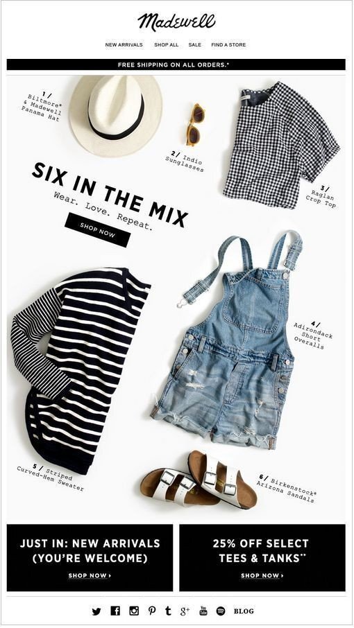
(Source: Email from Madewell)
It's better to make the content area no bigger than 900 px long. That's enough for three rows of product cards.
However, if you feel like adding a bigger number of product cards in your emails — you may use image carousels, accordions, or even videos that might be more informative than even hundreds of photos.
Email footer size
Some companies add menus to footers, so these footers are bigger than the classical variants of this element.
I prefer laconic footers that contain only the info that is 100% necessary. The сlassical footer should contain contact info (including your legal address), an unsubscribe link, social media icons, and the reason why you are reaching out to the recipients. That's all, so the standard footer dimensions of 600 px by 200 px are more than enough to place all this info.

(Source: Email from All Good)
Please refer to the email footer design blog post for more information on email footers.
Email font size
Email font size is another crucial issue to consider when building a template. You need to choose a font type and size that will be convenient for subscribers — not too small but not too large.
There are no strict standards here; rather, there are recommendations and best practices:
- Font size for headings and subheadings – 22-24 pt;
- Font size for body text – 12-16 pt;
- For more minor elements, such as the header and footer, you can use 10 pt.
For the body text, a font larger than 16 pt will look unwieldy and may be distorted in some media. Conversely, an overly small font, especially in combination with a too-long text canvas, will cause subscribers to scroll down without even reading the text. By the way, the recommended amount of text is about 20 lines.
Use a line height of 1.4-1.5 to ensure readability.
Mobile-friendly design for email newsletters
Of course, mobile email width does depend on the screen size of the smartphone and thus varies from smartphone to smartphone. But you may set special mobile styles for all the elements of your email, which will differ from desktop styles.
To enter the settings mode, please click the "Appearance" tab in the settings panel and then click the "Mobile formatting" section.
Here, you can set special individual parameters:
- text size for items in the "Menu" block,
- font size for headers,
- font size for footers,
- font size for content elements,
- font size for headings 1-3,
- alignment for headings,
- button text size, and
- whether you want your buttons to be displayed full size on mobile.
For detailed information on setting custom sizes for desktop and mobile screens, please refer to our "Mobile-Friendly Email Design" blog post.
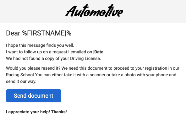
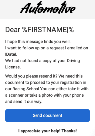
(Desktop device)
Total email size, aka email weight
If your email weighs a lot, you don't have any guarantees that it will not be clipped in such email clients as Gmail and Yahoo! Mail. Both Gmail and Yahoo! Mail will clip your email if the size of its HTML code exceeds these values:
- For Gmail: 102 kb;
- For Yahoo! Mail: 100 kb.
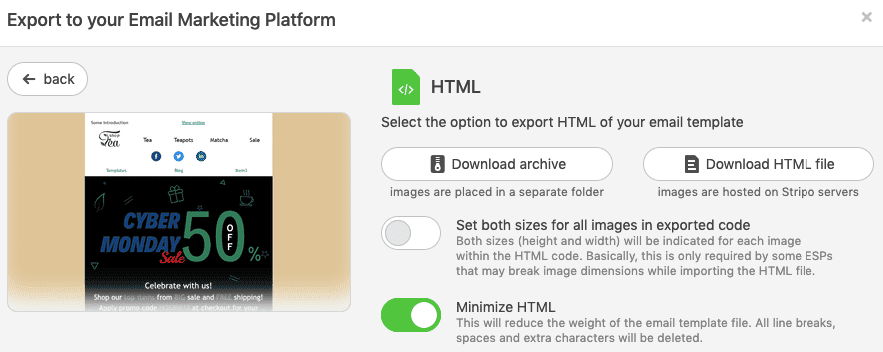
The email size often depends on the email editor you use. Usually, some extra characters will be automatically added to your email code when you're creating an email template. You may remove these characters manually to greatly reduce the email size or just choose an editor that will not add any extra characters to your emails. Stripo is one of these editors, providing pure HTML code without any system characters.
How to weigh your email:
You may use the email tester tool. It's free.
Or you can download your email template as an HTML file from Stripo to see its properties or info (Windows/macOS, respectively).

If the size of your file exceeds the claimed 100 kb, you might want to optimize it before you export this template to your email service provider.
Wrapping up
We have analyzed the widths and heights of an email template as a whole and of each individual element. A width of 600-640 px is the most popular among brands.
The height depends on the content length but should not exceed 2500 px.
The more images you add, the more crucial it is to use an image compressor. Sometimes, you may also need to optimize an email’s HTML code. And remember to create responsive emails.
As we have seen, there's no such thing as the best size for an email newsletter and no exact rules for email element dimensions, so you may experiment with forms and sizes.


14 comments